Finally the end of OUGD301 and oh what i have learnt. Looking back at this module im proud of myself for what i have produced. I feel i have really developed as a designer and finally made a transition to be a branding specialist. I have produced work which i am now finally proud to put it a portfolio.
As for the briefs which i produced, i again feel i have done a good job in most areas. I don't think that i explored designing across all medias to its full potential. In most of my briefs i found myself designing more for print than digital form. In several briefs where i wanted to design a website i found myself leaving it till most minute and sometimes never at all. This is disapointing but i feel its more a problem with time management and motivation.
In the early stages of OUGD301 i found myself lacking in motivation, and i feel this really did affect my body of work in a big way. Towards the latter part of the module, i once again found myself gaining with confidence and becoming a more organised, direct designer. I produced the best of this modules work in the last 3 weeks of the enter module. From this i have learnt if i manage my time more affectively and produce a schedule, like i did for the last 2 weeks of the module, I will become a more managed designer.
I encountered several problems over the duration of this module. From loosing work, to relying upon none existant print slots, i once again learnt never to trust technology and to always have a backup of work on a hard-drive.
Once again refering back to my final resolutions i feel the work i produced was to a high standrad and each piece was professionally finished. I am pleased with the body of work i produced for each brief however as mentioned before i do feel i could have produced a lot more. Rite the way through the design process i was always thinking about printing and what stock to use stock. I feel i have definatley made a transition from second too third year very well, and i can see this from my work and how i organise myself, my work and my time.
This first module of third year really has taught me a lot more than i thought it would, and finally i feel ready to go and head into the FMP with confidence as a designer. Refering back to my statement of intent - i feel this module really has helped me to realise who i am as a designer and clarrified that my specialism is in branding and identity. I will also be going into the FMP with a clearer mindset on how to manage myself and my time more effectively.
I am already looking forward to my feedback - i feel im aware of what im doing right and wrong but i want the clarification and feedback from the tutors to guide me into the final project.
.jpg)
Wednesday, 15 December 2010
Tuesday, 14 December 2010
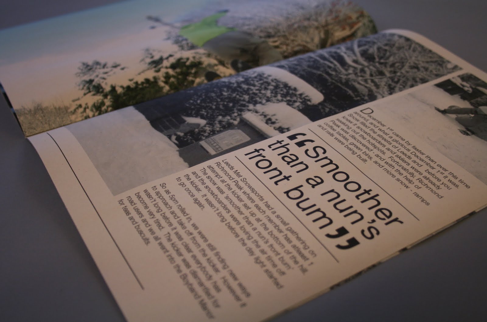
Snow LS6 (Final Resolution)
Snow LS6 is the day brief publication i produced after the spell of snow we had in Leeds. When i went to print - i was unsure on what stock i wanted the piece on. Firstly i thought of using a standard gloss stock for the cover. The inside pages i thought of using a matt or possibly a slightly lighter gloss stock.
However the print below is on newsprint. Because this is a heavily black and white publication the colour pallet worked with the off tone of the stock. The newsprints texture is very different from the smooth finish on gloss and matt. The newsprint has a very recognisable feel in terms of texture and weight.


However the print below is on newsprint. Because this is a heavily black and white publication the colour pallet worked with the off tone of the stock. The newsprints texture is very different from the smooth finish on gloss and matt. The newsprint has a very recognisable feel in terms of texture and weight.


Monday, 13 December 2010
Aedas Architects (Final Resolutions)
The Aedas architects brief was another quick turn around. However this time i am very pleased with the final outcomes. A lot of attention and development went into the logo so im very impressed with how it looks printed on the stationary sets. The colour pallet - again single colour really does work and fits well with the subject matter.
The type and layout across the full stationary set range works well for me. Im really like th typeface which i used as a part of both the logo and type in the set.
The orange and black work well together and do not fight for attention from the viewer.


The type and layout across the full stationary set range works well for me. Im really like th typeface which i used as a part of both the logo and type in the set.
The orange and black work well together and do not fight for attention from the viewer.


A2B Removals (Final Resolutions)
A to B removals was a very mixed brief in terms of sucess. I found myself very pleased with some factors and less so with others. The final business cards i was very pleased with - i feel their unique shape and immediate identity to removals works. The design is clever enough to stick in the viewers mind.
In terms of the logo - im pleased with the final identity. However i feel i may have rushed it towards the end and some extra details could have been added on - if i gave myself the time. The final letterheads and compliments slips turned out nice - however i was unable to purchase the brown bag like stock i wanted to print them on to.


In terms of the logo - im pleased with the final identity. However i feel i may have rushed it towards the end and some extra details could have been added on - if i gave myself the time. The final letterheads and compliments slips turned out nice - however i was unable to purchase the brown bag like stock i wanted to print them on to.


JP Photography (Final Resolutions)
James Philips Photography. I feel this is my weakest of the identity briefs i produced. I am pleased with the final logo - however i feel i slipped up on my type and layout in the stationary set. If i took my time and experimented a little more i feel i would have produced a much more professional finish.
Im pleased i used limited colour once again. I feel the logo has basis to develop on. Since he is a photographer one day he could put some of his images in the JP logo. It is a well developed logo i feel.


Im pleased i used limited colour once again. I feel the logo has basis to develop on. Since he is a photographer one day he could put some of his images in the JP logo. It is a well developed logo i feel.


Arbormann (Final Stationary Set)
Arbormann has also finally come to a close. The final resolutions are fantastic and the print quality is of a high standard. Below is the final stationary set. After some final touches, these designs were ready for print. I adjusted the tone of brown after a series of mock-up print outs. The business cards were also a huge sucess - the front side finished with a gloss print and the rear a matt - the cards worked individually and as a series with the compliment slips and letterheads.
Because i was pleased with how this brief had turned out - i decided to produce a case to give my client with his full stationary set inside. Just to add to the 'wow' factor instead of a standard envelope.


Because i was pleased with how this brief had turned out - i decided to produce a case to give my client with his full stationary set inside. Just to add to the 'wow' factor instead of a standard envelope.


I Am President (Final Resolution)
I Am President officially have a final album cover. Although the final resolution below is printed to a high standard using a variety of different stocks - this will be the limited edition album. The standard sale album will use the same artwork printed on a lower quality stock.
The piece below has the central striking artwork printed on canvas - a very high quality and expensive stock, which has never (as far as i know) been used on an album cover before.


The piece below has the central striking artwork printed on canvas - a very high quality and expensive stock, which has never (as far as i know) been used on an album cover before.


Studio 10 (Final Prints)
Below are the final printed Studio 10 stationary set. In the end i decided to go for the more mature colour pallet. The vibrant pink made the company look very cheap and young in character.
This darker tone has set of a much better feel of quality to the design. Im very pleased with the direction this design has taken. I am also very pleased with the final print outs.


This darker tone has set of a much better feel of quality to the design. Im very pleased with the direction this design has taken. I am also very pleased with the final print outs.


Thursday, 9 December 2010


Tuesday, 7 December 2010
Arbormann: Stationary Set Packaging
Because i am very impressed with the final stationary set - i decided i wanted to package it appropriately. Apposed to a normal envelope package, i decided the best way to make the client appreciate what they payed for, was to deliver the work in a custom package.
I experimented with the layout and dimensions of the package by using the stationary set items placed on paper.
In the end i decided to opt for the package which resembled the shape of the business card. I felt this worked with the concept being based on an arborist.


I experimented with the layout and dimensions of the package by using the stationary set items placed on paper.
In the end i decided to opt for the package which resembled the shape of the business card. I felt this worked with the concept being based on an arborist.


Monday, 6 December 2010
Studio 10 (Final Stationary Set)
Here is the final series of designs for the Studio 10 identity. For this stationary set i also added appointment cards onto my design list. I thought that if they had appointment cards which worked alongside the stationary set it would be more professional.
The business card is very unusual - as you will have seen in the developed mock-ups - the way this card is constructed is essential using 2 different stocks in one design.

Below: Appointment Card


Below: Letterheads


Below: Compliment Slips


The business card is very unusual - as you will have seen in the developed mock-ups - the way this card is constructed is essential using 2 different stocks in one design.

Below: Appointment Card


Below: Letterheads


Below: Compliment Slips


Studio 10 (Development) 2
Below are several developed ideas which i had for the Studio 10 brief. At one point i started playing with a different name to experiment with type and image. What i didn't realise is when i was using an illustration to make a C - if i simply reflected it, it would make an S.
I found this process very helpful - i simply hammered out as many designs as i could in 10 minutes and now that has set me in the direction i wish to persue.

I found this process very helpful - i simply hammered out as many designs as i could in 10 minutes and now that has set me in the direction i wish to persue.

Studio 10 (Development)
Here is some of the logo development so far for the Studio 10 brief. Because this is a woman only salon - i want to make viewers aware of that immediatley. I already have a general idea in the direction i wish to take this design, and below is the process on how im going about it.
Aims for this identity are to keep it simple. A limited colour pallet and fully legiable type.


Aims for this identity are to keep it simple. A limited colour pallet and fully legiable type.


JP Photography (Final Stationary Set)
This is the final stationary set for JP Photography. Im rather happy with the final outcome and feel that the direction i took the logo in was the rite decision. I wanted to keep the design very minimal in terms of colour pallet - and i wanted the expensive feel of the range to come from stock choices that i print the final resolutions on.


Below: Letterheads


Below: Compliment Slips


Below: Letterheads


Below: Compliment Slips


Subscribe to:
Comments (Atom)