Showing posts with label Arbormann. Show all posts

Monday, 13 December 2010

Arbormann (Final Stationary Set)

Arbormann has also finally come to a close. The final resolutions are fantastic and the print quality is of a high standard. Below is the final stationary set. After some final touches, these designs were ready for print. I adjusted the tone of brown after a series of mock-up print outs. The business cards were also a huge sucess - the front side finished with a gloss print and the rear a matt - the cards worked individually and as a series with the compliment slips and letterheads.

Because i was pleased with how this brief had turned out - i decided to produce a case to give my client with his full stationary set inside. Just to add to the 'wow' factor instead of a standard envelope.


Tuesday, 7 December 2010

Arbormann: Stationary Set Packaging

Because i am very impressed with the final stationary set - i decided i wanted to package it appropriately. Apposed to a normal envelope package, i decided the best way to make the client appreciate what they payed for, was to deliver the work in a custom package.
I experimented with the layout and dimensions of the package by using the stationary set items placed on paper.

In the end i decided to opt for the package which resembled the shape of the business card. I felt this worked with the concept being based on an arborist.


Saturday, 23 October 2010

Arbormann (Compliment Slips) Finals

So here they are. The final compliment slips to run alongside the business cards and letterheads. Im very pleased with how this brief has turned out so far - the next stage is to contact a printers to have the stationary set printed with a high level finish.
I also need to choose a stock which suits the design and reflects on the high standard of design.

Arbormann (Compliment Slips)

Here are the compliment slips. These were easy enough to produce because of the layout i have already set for the letterheads. The only problem i have come acros at the minute is what colour the text is going to be 'with compliments'.
I want to keep the colour pallet as minimal as possible. So i decided to use the brown and gold for the text. The brown has worked a lot better as it is more legiable than the gold. Like on the letterheads - these will also have a front and reverse side which will hold the logo.


Arbormann (Letterheads) 2

Going back to the letterhead design after playing around with the colour pallet in the previous post - i decided to match the colour pallet identicly with the business cards.
I feel this has worked for the better. The layout i took from my previous post of experimentation in terms of where to place the logo and contact details.
When i tried the layout without a background image, it looked too plain without carrying any of the character that the business card holds. So i brought in a new image and adjusted the opacity so that the body text could still had readability.


Above shows my experimentation with the front side of the letterheads. At first i placed the logo in the centre of the page. However once i printed one off and folded it down to fit into an envelope i found the logo was cut off and that it no longer held its proffesional image. So i have now placed the logo at the top of the page.

Arbormann (Letterheads)

It was time to finish this brief. After my recent crit - I was told that I had all the work there and the ability to finish the brief within the next few days.
So i got straight to work today to finish the stationary set for the Arbormann brief. I wanted to make the stationary set work as a series, with colour pallet, type, logo etc. Below i experimented very briefly using minimal colours and transparency in illustrator. I didn't like the finish at all - i felt it was too soft apposed to the colour pallet of the business card.
Back to the drawing board it is.


Arbormann (Final Business Card)

After a recent crit where i printed out what i thought were the final mock-up business cards, it became clear that some of the text was not legiable in an ultralight typeface. I went back to the design immedietley and made sure that all type was legiable.
After printing off the final mock-up i found the colour pallet worked well. The type was complimented in gold sat on the dark brown which was a spot colour from the image on the front side of the golden tree.

The cards will have a high end print finish. The front side of the card will be a gloss finish while the reverse side will be a matt finish with the type spot varnished the golden/yellow.

Saturday, 16 October 2010

Arbormann (Clothing)

Okay so it was time to put the logo across different medias (including clothing) Since safety is a big part of this industry i thought it would be good for Arbormann to show their professional finish not only with the business cards but also with what they wear.
I turned the logo into a smart object and imported it into photoshop. Here i tinkered with the layout of the design - I had to get rid of the logo which was already on the helmet (not hard)
I feel the Arbormann logo works well on the helmet. I think I will get these printed on clear stickers so they can be placed straight on the helmets.


Arbormann 11 (Final)

Okay so this is the final logo and business card. I had a bit of a stressful point during the brief where my client informed me of some sort of misunderstanding to the company name. Long story short - I have searched previously to see if the name already exists (which it does not) so I have copyrighted the brand name to make it exclusive for my client. I have looked into legal terms and im covered because I have produced and catalogued all the artwork for the development of the logo.
Im very pleased with the final outcome. I feel i have worked the colour pallet well and that the final prints will be very proffessional and printed at a high standard. The front of the card will be a gloss finish where as the reverse side will be matt with spot varnish over all the type.

Friday, 8 October 2010

Arbormann 11 (Possible finals)

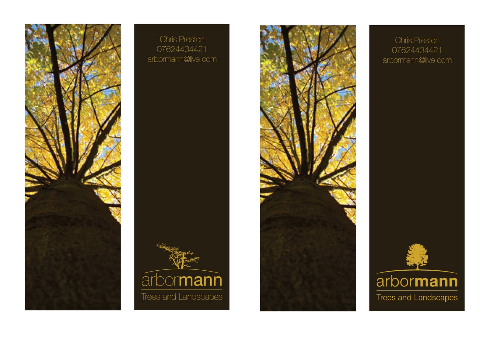
So below I have two of the final resolutions. Here im looking into where to postion the final logo and contact details before i get the cards printed. I feel the lowest example flows better from top to bottom - however in terms of hierarchy the top design is the rite way to go. This tells the viewer what the business type is, what they do and how to contact them.

I feel i will be going ahead with the top piece because of the reasons above.
Printing - I feel a high gloss front with a matt brown reverse side with spot varnished type. This will give it a very professional and high quality finish which im sure my client will be pleased with.


Arbormann 10

Okay - so below is the revised logo. On the left you can see the existing logo with the half dead tree at the minute. On the right is the new logo where I have brought in a new 'lifelike' tree. I have also rounded the bottom line to give it a better flow above the type.

At the minute i like the new direction - i think im going to have one last look at the layout of the logo and contact details. I feel it may work with the logo up top. This also works better for the hierarchy. But at the minute im more than happy with the logo, imagery and colour pallet.

Arbormann 9

Once again turning to the layout of the contact details and the logo - i decided to place them straight and allow space in the centre for the buisness card to be held allowing the viewer to see all the details. However now it comes to the decision of hierarchy - shall i put the logo at the top of the document or the contact details followed by the logo in a bold print finish.
I decided to go with the design on the right - i feel it has a better flow and even with the logo at the bottom it is still a very prescent design on the reverse side.

To do list:

  • print out and test legiability
  • Review current logo (tree mainly)
  • decide on typefaces weight for contact details

Arbormann 8

After going back to the brown reverse side. I changed the type back to a clean golden-yellow. Once doing all this i then went back to the layout for the type. I have been finding it hard to place both the logo and contact details together on this small canvas since reducing it to half the size for more affect lenght ways.
I feel all these layouts are to fiddly to the user to read. Plus i need to look into legiability and print off some mock-ups for testers.

Arbormann 7

I decided to have a quick experiment with colour on the reverse side of the business card. I tried to take the golden-yellow from the frontside image and the turned the type to an aok brown colour.
I did like the finish however when I look at it i think of caramel chocolate. I did like the type in brown however i feel the cards look more professional with a darker finish.
The type still needs to be looked at along with the current logo. I feel a more affective and lifelike tree would be appropriate instead of a half dead branch.

Thursday, 7 October 2010

Arbormann 6

After my previous post I set out on a mission to find new imagery and play around with the layout. I feel I have achieved this and that the business card is starting to take a nice direction. I still need to play around with an illustrated logo - however for now I am certain that the scales, type and colour pallet is working well. Belows examples are the initial experiments with the type layout and colour. The lowest examples show how i have experimented with the scales of the business card. I have never done a portrait business card, however i feel it works well with this subject matter. The image helps carry the unusual format for a 'height' factor.

Next to do list:

  • Illustrated logo
  • Print out mock-ups to test legiability
  • Work on reverse side of business card


Arbormann 5

Okay so now i have decided to take the business cards in a new direction. I have decided that I will be keeping the logo type based (however i am still considering a small illustration to run alongside it) Belows developments are okay for the time being. Im not fully committed to this image that I have used and feel one with a more vibrant colour pallet would do the trick.

Things to consider:

  • Scale and shape
  • Colour pallet
  • Imagery
  • Illustrated logo
  • Reverse side?

Wednesday, 6 October 2010

Arbormann 4

Taking the design in a completely different direction here playing with both type and image. By using a limited colour pallet the design is both cost affective and eye-catching. After doing these designs very quickly i have found that it may be a better option to keep the business card standard scale however play around with the colour pallet and possibly incorperate the use of laser cutting.

Arbormann 3

Im trying to experiment with the scale and shape of my business cards at the minute. After recent success with my own identity and stationary set I feel this would be a good direction to take my work. The designs below reflect this in terms of playing around with the scale and shape of the artwork. I feel this is going in a good direction however i have not exhausted other concepts yet which i plan on doing.


Arbormann 2

I decided to go back to the drawing board and sketch up several new ideas. Below are a few of them once again taken into illustrator. As i said in my statement of intent i plan on experimenting more with the print finish of my work. These designs were produced based on that idea. I would like to see the final business card possibly embossed or foil printed dependant on the final resolution.

Arbormann 1

Work has begun once again. The brief which I am starting with is Arbormann Trees and Landscapes. The brief is to produce an identity for this new tree surgery business. There are no limitations in terms of design, colour pallet or finish. Below are my initial ideas put into illustrator however I am not satisfied with these and intend to develop the identity further.