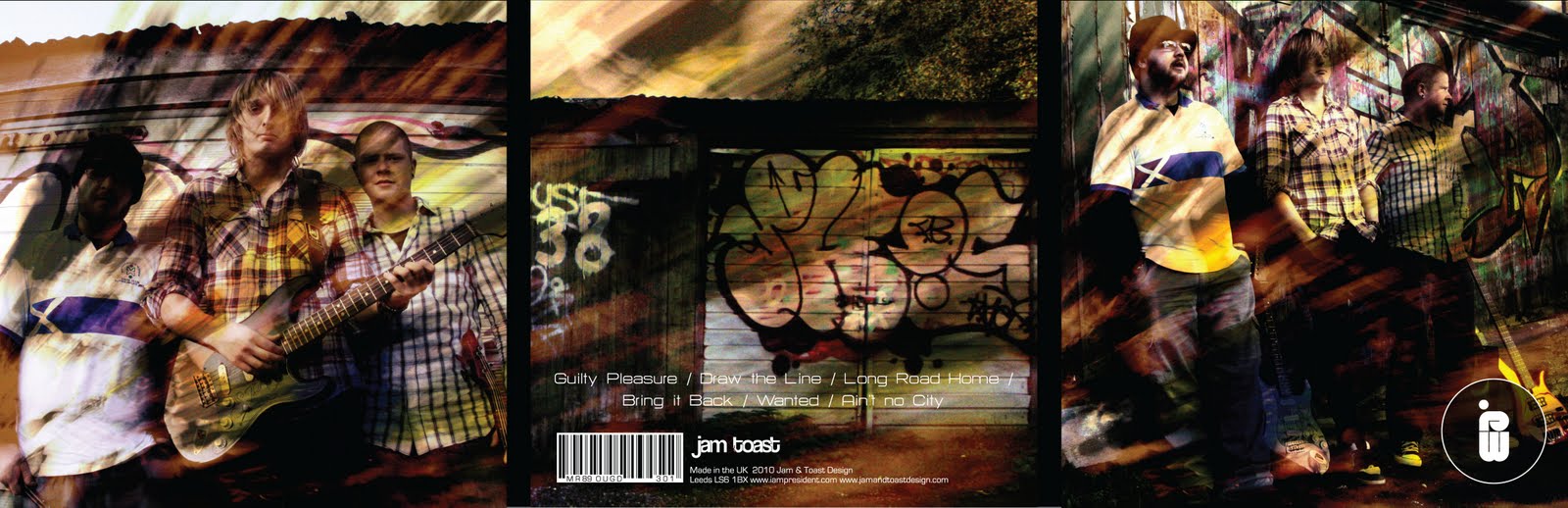
The piece below has the central striking artwork printed on canvas - a very high quality and expensive stock, which has never (as far as i know) been used on an album cover before.
Showing posts with label I Am President. Show all posts
Monday, 13 December 2010
I Am President (Final Resolution)
I Am President officially have a final album cover. Although the final resolution below is printed to a high standard using a variety of different stocks - this will be the limited edition album. The standard sale album will use the same artwork printed on a lower quality stock.
The piece below has the central striking artwork printed on canvas - a very high quality and expensive stock, which has never (as far as i know) been used on an album cover before.


The piece below has the central striking artwork printed on canvas - a very high quality and expensive stock, which has never (as far as i know) been used on an album cover before.
Labels:
I Am President,
IOM College Presentation,
OUGD301
Thursday, 9 December 2010
Monday, 6 December 2010
I Am President (Album Artwork) Mock-up 2
Another mock-up to show you. However this design is going to be the album cover used when producing the limited edition screen printed vinyl.
I like this design because of its eye-catching style. The design will be just a small part of the final resolution. Although this is just a mock-up - you get a real feel for how the design works and how it will be seen by the customer.


I like this design because of its eye-catching style. The design will be just a small part of the final resolution. Although this is just a mock-up - you get a real feel for how the design works and how it will be seen by the customer.
I Am President (Album Artwork) Mock-ups
Here is a post to show a few mock-up album covers i have produced. Mock-ups are a very useful way to find floors in the design. When i produced these mock-ups i found a few problems with legiability on the reverse side of the albums. However i will look at these examples below in terms of aesthetics and sellability.


Below: The 2nd mock-up using vintage imagery. The client gave me some feedback a few weeks ago where they liked this approach to the artwork - however this was before they saw the range which i have now produced. The design below shows problems with legiability and format which will be addressed.


Below: A 3rd mock-up that uses some imagery from the photoshoot i did earlier in the module. I like this design - however i feel it doesn't perform any differently from other albums. I like the colour pallet and type layout - however this mock-up has shown me some areas of questionable legiability and format.

Below: The 2nd mock-up using vintage imagery. The client gave me some feedback a few weeks ago where they liked this approach to the artwork - however this was before they saw the range which i have now produced. The design below shows problems with legiability and format which will be addressed.
Below: A 3rd mock-up that uses some imagery from the photoshoot i did earlier in the module. I like this design - however i feel it doesn't perform any differently from other albums. I like the colour pallet and type layout - however this mock-up has shown me some areas of questionable legiability and format.
I Am President (Album Artwork) 20
This is going to be the final - Limited Edition IAP Vinyl. The image below shows the product as it will be finished. The gold overlay on the image will be screen printed where as the rest of the design will be digitially printed.
As i said in a previous post - the screen print will act as a seal for the packaging and make this product a limited edition.

Below: The product will look like this when it is digitally printed (before the screen print is layed over)

Below: This is the image which will be printed onto acitate. The image will then be burnt through to a screen, which will then allow me to print it over the digitally printed vinyl.
As i said in a previous post - the screen print will act as a seal for the packaging and make this product a limited edition.

Below: The product will look like this when it is digitally printed (before the screen print is layed over)

Below: This is the image which will be printed onto acitate. The image will then be burnt through to a screen, which will then allow me to print it over the digitally printed vinyl.
I Am President (Album Artwork) 19
I Am President (Album Artwork) 18
Another selection of different designs and layouts for the limited edition vinyl cover album. I decided to use one of my initial album designs as the screen (the gold area) In these examples i have also experimented with the stock colours. I feel the black and the white stocks work better than the lighter and darker shades of grey.
I feel the album cover is taking a very nice direction in terms of the design. Some more development is needed - however the design is becoming a whole.
I Am President (Album Artwork) Ltd Edition
After speaking with Joe (our visiting professional) he showed me some amazing examples of artwork for limited edition album covers. So i decided to give it a go myself.
Below are several designs which show what would be a 'finished product.' A small part of this design would be screen printed which would seal the product. Let me explain.
The IAP logo (right hand side) is the screen printed part of this product. Which covers the actual album (below the IAP logo). The album will be mounted on an old-school vinyl cover which will hold a limited edition poster and memorabilia inside.

Below: Same as the examples above (however i put the front cover on the wrong side). Here i am just experimenting with layout, colour etc.
Below are several designs which show what would be a 'finished product.' A small part of this design would be screen printed which would seal the product. Let me explain.
The IAP logo (right hand side) is the screen printed part of this product. Which covers the actual album (below the IAP logo). The album will be mounted on an old-school vinyl cover which will hold a limited edition poster and memorabilia inside.

Below: Same as the examples above (however i put the front cover on the wrong side). Here i am just experimenting with layout, colour etc.
I Am President (Album Artwork) 16
Going back to the IAP brief - i have once again returned to the essential album cover artwork. The designs below are for the 'off the shelf' album. Which will be the standard album avaliable. I managed to select 4 designs (below) of which 1 will be selected for the final publication. This design however will be different from standard album covers. The album artwork will be printed directly onto canvas material. The inside of the album will be constructed from hardboard (black).
Saturday, 20 November 2010
I Am President (Album Artwork) 15
The album artwork is going in the direction i want, finally. I have manged to make the colour pallets of the photographs work along with the logo (front and reverse)
I took a shortened down logo which i see representing the band in the future and made this the main focus point on the reverse side of the album cover.
I'm really liking this direction - however after looking at a netting book - i found a new album cover layout (which allows me to print, and hand-render the final resolution - along with picking a suitable and heavy duty stock)

I took a shortened down logo which i see representing the band in the future and made this the main focus point on the reverse side of the album cover.
I'm really liking this direction - however after looking at a netting book - i found a new album cover layout (which allows me to print, and hand-render the final resolution - along with picking a suitable and heavy duty stock)

Friday, 19 November 2010
I Am President (Album Artwork) 14
Below we have some revised album cover designs. I decided to go back to using some imagery which i have previously taken for this brief. I wanted the colour pallet of this piece to catch the viewers attention - and i feel i have acheieved this while maintaining a look which suits the target audience.
I'm pleased with the direction these designs are taking and feel a few more experiements will see me to my final resolution.


I'm pleased with the direction these designs are taking and feel a few more experiements will see me to my final resolution.


Labels:
I Am President,
IOM College Presentation,
OUGD301
Wednesday, 10 November 2010
I Am President (Album Artwork) 11
Decided to get the pencil out. The direction that the album cover is taking at the minute is changing to what i originally had planned in terms of packaging.
I drew these quick sketches to get the idea out of my head. I prefer the direction the design is taking now and feel that when a final resolution is produced, the printed product will be brilliant. There may still be time to produce an outer shell. Lets see how it goes.


The idea now is to have the album consisting of 3 flat spaces (6 sides) It will obviously inculde the audio cd along with the track listing booklet, and a unique format poster which will fit in the oppositie sleeve.
I drew these quick sketches to get the idea out of my head. I prefer the direction the design is taking now and feel that when a final resolution is produced, the printed product will be brilliant. There may still be time to produce an outer shell. Lets see how it goes.
The idea now is to have the album consisting of 3 flat spaces (6 sides) It will obviously inculde the audio cd along with the track listing booklet, and a unique format poster which will fit in the oppositie sleeve.
I Am President (Album Artwork) 10
Okay so here are some test prints that i have done. Although this will not be my final choice of stock, it still gives me an idea on how the colour pallet is printed and how vibrant/dull it will actually be. Im not over the moon with the way these colours have come out to be honest. I know where i have gone wrong however so its back to photoshop to re-edit those images.
I have also pointed out a couple of factors.


I have also pointed out a couple of factors.
- IAP Logo - Not legiable at that scale
- J&T Logo - same as above
- Reverse side type (change to 10pt)
Tuesday, 9 November 2010
I Am President (Album Artwork) 9
This was a big stage - time to start experimenting with the reverse side type. There is a track list now, which consists of 6 song titles. The below examples give a first impression of some of the locations i could position the track list.
The 3 examples at the bottom show the designs including the logo designs and spine covers type design. In all those examples i have included the I Am President logo and my own Jam & Toast logo for recognition when the album is released. So far the album covers colour pallet is working well with the type and both the logos.

The 3 examples at the bottom show the designs including the logo designs and spine covers type design. In all those examples i have included the I Am President logo and my own Jam & Toast logo for recognition when the album is released. So far the album covers colour pallet is working well with the type and both the logos.

I Am President (Album Artwork) 8
This is the stage of logo and type development. I got feedback from my client to the prefered logo and have decided to immediatley add this design to the album cover. This is just initial idea generating. I have an idea where the design is heading, and the reverse side will be getting experimented with in terms of typeface, colour pallet etc.
I am going to be playing around with the finish immediately, and start adding my own Jam & Toast identity to the design.
Next stage: Play around with composition and text.


I am going to be playing around with the finish immediately, and start adding my own Jam & Toast identity to the design.
Next stage: Play around with composition and text.


I Am President (Album Artwork) 7
Now i have started applying the imagery to the album layout. This is just a simple format album cover - which i will be printing mockups of later this week. The designs look good, and although i have not applied any logos or text to the images, i feel they are very unique and work so well already. The text will be minimal yet affective.
I think i will be going with the second design. The reverse side image will work a lot better with type. It is a flat image with nothing particular on it. However the top design uses another image of the band which uses more colour and makes layout of type difficult.
I Am President (Album Artwork) 6
Looking back at some of my older work. I decided to go back to the images i got out of the photoshoot i did with I Am President earlier last month.
I thought splashes of colour would look sick om this design and work well together alongside the new logo and the text on the reverse side of the album cover. The images are working at the minute and work as a series - and should work together on both the front and reverse side of the album cover.


I thought splashes of colour would look sick om this design and work well together alongside the new logo and the text on the reverse side of the album cover. The images are working at the minute and work as a series - and should work together on both the front and reverse side of the album cover.


Subscribe to:
Posts (Atom)