Sunday 25 October 2009

Type (Paragraphs and Images)

Another Thursday afternoon means another Type lecture with Visually communications very own Graham! This week were learning about how too use column's in the layout of our work, and how point size, weight, type etc can be used too full advantage even in the smallest of spaces.  Below are all my column set-ups and layouts, going from one grid (full page) too a 5 column layout.  All the image below are screen shots from InDesign @ A4 scale. 


Above - A screen shot showing all 5 of my layouts.  This screen show was on 'Normal', the following shots are on 'Preview' which means you do not see the guides or columns used. 


Above - We start with the single Column layout.  In this what was found in the class was because of the massive space too fill, the point size of the type could increase to around 10 - 12. The 'Leading' was also found too be (on average) 2 - 3 point sizes larger than the type itself.  We were then told by Graham this would be a great rule to follow in general, eg: 9 point type - 12 point leading. 


Above - Two column layout.  I found this simple enough too adjust too, the hardest point for me was scale and layout of the image.  After several attempts including placing the image central, bottom right etc ... I found top left was best suited as it directed the viewer too the text below immediately. 


Above - Spacing was becoming a large issue now.  Graham said that viewer of a piece could be 'scared off' from reading the text if there seems too be too much of it - and he was so rite!  My first attempt at this saw the leading brought closer, the point size smaller and the image larger. After Graham explained how seeing white on the page makes the viewer read it, I decided too space out the paragraphs and align the text too the right ... and what a difference!


Above - Although you may see the text is only in 3 column's ... in reality it is in four.  During the lesson when i came across the problem of a lack of words per line, point size too small etc i viewed the column's purely as guides and decided too 'brake the rules' by spreading my text across the two.  This way it makes the text more legible and more aesthetically pleasing.


Above - Again appyling my rules from the layout above, the 5 column layout just saw the number of words per line become fewer and fewer.  Too solve this I placed the image central and in one of the single columns to show the viewer the space I was working in.  Once again I brought the paragraphs in-together but then indented them too separate it for the viewer. 


Above - I decided too make a print screen of my final 5 column layout along with the guide lines so you could see the spacing we were asked too work within.  If you look closely you can see the text has several lines coming through the direct centre.  The right line is where the first grid ends, then the following line is where the next column begins.  The space between the two = guttering.  
What have I learnt this week - well read above ... a lot!  Grahams lecture manage too get me focused and engaged and I never thought I would say this but, I love type!

Thursday 8 October 2009

Emotion in Type ...

Another lecture with the ridiculously hilarious Graham.  This week its all about weight, tone, and using more than just one word.  So we start the lecture with having too write 'FOUR THREE TWO ONE' but then we are told it has too read 'ONE TWO THREE FOUR.'
So this is my interpretation of what we had too do below -


The idea was to make the viewer read from right too left instead of left too right.  The way i did this was too increase the point of the first word I wish the viewer too read (ONE) once I had done this I also changed the weight too bold.  From this step on I went smaller and smaller with each letter so that the viewer would read it as the eye catches. 


Making seperate type boxes was the next step.  But we also had to play with the layout while making the viewer read the type as 'ONE TWO THREE FOUR' so I decided too use different fonts too make bolder and more noticable type.  I am pleased with how this came out, when enlarged in better detail it is easy for the viewer to understand my system and I feel it worked well. 


So were told to choose a phrase.  'Easy come, easy go' 
This time we had to do the same, make the viewer read the text as it should be for example, if i got it wrong the viewer would read 'go easy, come easy' .... anyway another rules was NO PUNCTUATION! 
So I started with the simple upper and lowercase.  Uppercase for the first part of my phrase, and lower for my second.  too make sure my vie
wer read the text as I wanted I turned the 'easy go' upside down and made it lowercase.  Another part of my process was too make my starting word very bold - black as the night. and each word (in order) after that would be a percentage tone of black.  


Once again were told to experiment with layout.  So I went straight for the eye catching easy, which immediately directs your eye too 'come' on the right hand side.  After letting your eye explore the page you see 'easy go' (lowercase once again) in the bottom right hand side of the page. 


This was the one I wanted too get rite.  I only wanted too use the word 'easy' once, even though it comes into my phrase twice.  So i went for the bold uppercase 'easy' using helvetica.  Because we were told that it is involuntary for the reader to go from right too left i thought that was best place too put 'come' in uppercase but using a 70% tone of black so the viewer does not read it first.  I hope the reader then reads 'easy' again before spotting 'go' on the bottom left of the 'E'.  I used lowercase helvetica in an ultralight weight.  I am pleased with how this came out ... but gutted if it does not work, however its all part of the learning process.  

Wednesday 7 October 2009

Emotion in Type ...

So we start the afternoon in Mac-suite 201 greated by the most insane tutor I have met in my life - Graham!  But its not a bad thing ... its actually great, the way Graham connects with the class is amazing, I couldn't help but listen to his every word intensely while he jumped around the room like a swan on acid!  But anyway ... I learnt so much in that afternoon about type, my previous 'knowledge' was just flushed down the toilet.  The way we were taught about how too use the strokes on our words (ultralight, light, regular, italic, bold and bold italic) how colour was not necessary, how layout and point size was so important even in a type filled page.  Below are my interpretations of what we had too do, each one comes with an explanation - enjoy! 


Above: We started the class with Graham asking us too type our name, in any type, any scale and anywhere on the page so that it showed our personality.  I started with 'helvetica' in 144 point (on an A4 document) lowercase and positioned direct centre.  This shows my personality to being quite but at the same time confident.  I used a ultralight stroke to show more of the quite side of my personality.  The point size and area of layout shows the confidence I have in myself.


Above: You can just about make out the word 'dog' in lowercase, helvetica.  Graham asked us too add emotion too the word as if this dog was scared and lonely.  Where better too put this than the bottom corner of the page too start with.  Lowercase symbolizes - small, fragile, quite, scared and lonely.  Once again colour was not allowed too be used. 


Above: Once again the word 'dog' only this time it had too be an angry, confident and powerful dog.  So opposite too last time i used uppercase - this shows power and strenght.  I went for 'impact' type which speaks for itself, and positioned the type in the centre of the page too make a statement of power and confidence.  

Sunday 4 October 2009

Summer Postcards (random)

Playing on illustrator in the office ... ok ok my bedroom and started placing my home made building typography in different positions on the page.  Anyway I finally managed to put it back together, kind of - too make this small poster ... again using the word construction.

Fin. x 

Summer Postcards (pictogram)

After developing some of my initail idea's on design sheets I decided to build on some concepts on illustrator, that way I will get a clearer and tidier image to work with.  
Below show some of my developments on illustrator getting these pictograms too a professional standard.


So thats some of the illustrations i have produced as part of my development for the pictogram. The piece above can be ignored because unless i use yellow stock it is wrong to the brief - the brief states i must use once colour in the pictogram postcard. 

Summer Postcards (word)

This is it ... i think, my final resolution for the word postcard (I think)  Any feedback would be great!  I decided too use the yellow as one colour and use the gradient affect so it used transparencies of the colour, black was my second colour and grey was my third.  The paper stock was white due to yellow fading to white on the right hand edge.  


Feedback would be appreciated here especially please, hope your enjoying what im doing!

Summer Postcards (word)

Now that I have completed the full word, I need to start working upon a way too develop and 2 colours (max) I dont want too over complicate the image, so I wish not too add colour into the type word), but instead the background.  
Below is some of the development which has been going on in the last day or so ... feedback again please. 


So that is some more development from my original concept.  I have tried too use limited spot colours.  Although I can push the use and number of colours further I feel the piece does not need it, and that if I do use more, it could distract the audience from the detail in the typography. Feedback would be grand!

Summer Postcards (word)

After a fair bit of time spent in front of the computer live tracing and adjusting scales of images etc I had box eyes. BUT finally I managed to complete my full word ... and here it is for you all to comment and give feedback on! 


Sorry about the small scale of this image ... however it does work as a test for legibility and if it works at different scales.  Feedback please people.

Summer Postcards (word)

From the design sheets - I have produced several good idea's which I can build my concepts from.  However one which I have decided to carry on developing is too make the word 'Building' from using images of machinery/tools which I used over summer. 
Below are a few letters I have developed so far for my word ... see if you can see what machinery/tools I used - any feedback is welcomed!


Well thats some of the development so far using illustrators live trace and live paint tools ... very useful!  Feedback would be great, cheers!

Friday 2 October 2009

Summer Postcards (logo)

After finally getting the dumper illustration rite (like a pictogram) I decided it would be a good idea to experiment with colour.  This would help me decide what the stock colour and type would be, and how I could use the rules of spot colour and tones too my advantage. 
 
So this is where the experimentation of colour took us too!  But I could see that this logo was not taking the form that I had intended!  I decided too take it back too the drawing board and started by using the word 'Dumper" for my logo.  
This gave me several great ideas and with a big hand from Lorenzo (tutor) a new concept was born.  Through several sketch's a new piece was being made.


So thats where the logo development has got too! all that i need too do is decide and develop one of my designs.  I have kept too all the restrictions required by using only 2 colours - but too get around this and add more detail too the logo I have used tones of my two colours.  
My two colours are black and yellow! Feedback would be grand once again.

Summer Postcards (logo)

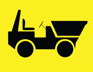
After producing the design sheets and selecting an idea to take forward I got onto illustrator again and started to make an outline or a dumper truck - a bit like a pictogram really. 
Below is the development of what started off as a terrible illustration!


Sooo ... just a little look at the development of my logo, now I need to experiment into colour, layout and type. 

Thursday 1 October 2009

Summer Postcards

So were back in uni ... and straight into work (not a bad thing)
First brief back, as expected is based on our summer, our experiences, our work and our collections! 
The brief is to produce a set of 4 postcards based on our summer - now this module is based on print ... so as per usual we have restrictions on what our designs can include.  

1 - Full colour image, photograph or illustration
2 - 1 colour pictogram, representing an activity 
3 - 2 colour logo, fictitious or real organization
4 - a 'WORD' 3 colour max (plus tints) vector based

"Great ... I'm sending postcards from a building site!"