Tuesday, 9 November 2010

I Am President (Album Artwork) 7

Now i have started applying the imagery to the album layout. This is just a simple format album cover - which i will be printing mockups of later this week. The designs look good, and although i have not applied any logos or text to the images, i feel they are very unique and work so well already. The text will be minimal yet affective.
I think i will be going with the second design. The reverse side image will work a lot better with type. It is a flat image with nothing particular on it. However the top design uses another image of the band which uses more colour and makes layout of type difficult.

I Am President (Album Artwork) 6

Looking back at some of my older work. I decided to go back to the images i got out of the photoshoot i did with I Am President earlier last month.
I thought splashes of colour would look sick om this design and work well together alongside the new logo and the text on the reverse side of the album cover. The images are working at the minute and work as a series - and should work together on both the front and reverse side of the album cover.


I Am President (Album Artwork) 5

So i downloaded yet another new typeface the other day and decided to test it out. This fonts purpose is to create illusions, shapes which make the mind work hard to make legiable. The designs below says 'I Am President' - sepereated into 3 letters per row. I really like this design and feel the client will feel the same. This is the perfect chance to work on some packaging design (which im not the best at) and try and make it a new skill.


These designs will be using an outer shell and an inside sleeve. The outer shell is the black case which holds the IAP logo on the front and the spine of the case. The logo on the front side of the shell will be laser cut out, so the pattern/type design, on the inside sleeve can be seen through.


I Am President (Album Artwork) 4

Below are another couple of album designs i produced last night. These designs are very quick turn over, 15 minute jobs really. I like the composition of the type, and this is one of my prefered logos. However it is not one which the client took a liking too so this is just to fill some time while i recieve feedback. I like the direction however i feel they designs are a bit too flat for album artwork. If this is going to be purely type based - i need to do something unique that the consumer will remember.

Monday, 8 November 2010

Personal Work

This is just a little play around with a typeface i downloaded. I love playing with symetrical shapes and compositions, so this was great fun. And after a talk with fred i stopped using paper scales and went for my own format.


I Am President (Album Artwork) 3

Just having a little experiment with some imagery. Wanted to play around with the images meaning to the logos design. I dont know what the client thinks of these designs, so im looking forward to their feedback. I like having a play with imagery and text and feel i could take this further.
Not sure on the lowest example. I dont like the dull colours. If i was to bring in a colour pallet i would like it to be more vibrant and blend with the logo more.


I Am President (Album Artwork) 2

Heres another direction i took using a bit of type. I added the speach marks to simply add the inpretion of saying "I Am President."
I have tried this example out with several of the logo designs. The bottom examples are the clients prefered logo designs on the album artwork.
I like the direction these designs are taking however i do not feel they represent the bands image, so i will be experimenting further with the albums artwork.


I Am President (Album Artwork) 1

I had a tutorial today with Fred - and he gave me some sound advice on how to get started with the album artwork. I hit a wall in terms of design direction rite now - with struggling to establish a final logo design with my client - i was told to get stright on and start simple.
I have initial design below which the album covers soley carry the logo. So here are a couple of examples of the logos which the client liked placed onto an album cover format (just to get me into a design mood)
Not too sure about this design as an album cover - although its minimal its not to my liking, back to the drawing board.


I Am President (Album Cover) Packaging 3

So here it is. The first album mockup. As you can see from these images, there is an outer shell which is to hold the inner sleeve which will hold the cd/discs.
The inner sleeve i got inspiration from the Artic Monkeys album - which is very unique and was completely individual when it was released nearly 2 years ago.
Next plan is to design some artwork which could work with this packaging design. I also need to contact the client once again to see if this design will work for them. If not i will produce another mockup album cover. Its not too much work - and i find it actually very interesting and love getting hands on with some of my work, apposed to my usual digital finishes.


I Am President (Album Cover) Packaging 2

Now i have produced the insert for the album cover, i can produce the mockup for the outer shell. The insert was easy enough to build as it was just one piece of flat card for now. The outer shell is to hold the insert - however the final packaging design will be unique in how the bands logo is printed/finished.
Next step is to finish the mock-up then carry on with the album artwork and build another album mockup to the artwork designs.


I Am President (Album Cover) Packaging 1

Okay so i decided to make a start with the album packaging. I wanted to try and do something different with this piece - the logo's were being finalised and hand picked by the client so while they got on with that - i went for carrying on with the brief.
Firstly i began by making a quick sketch for and idea on how to produce my first mockup. The images below show the inital stages of my mockup being created. I found the design was easy enough to produce - at first the measurements i originally made were wrong, so after a quick revise, i made some changes and carried on.


Wednesday, 3 November 2010

Shammix (New Brief)


I Am President (Logo Development) In Context

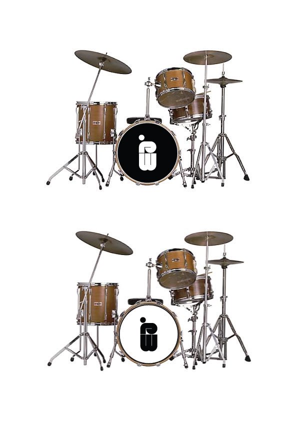
Here they are - the series of logo designs i added on the previous blog post, put into context on the front drum of a drumkit. This was an essential point for my client. They obviously wanted the logo to work across a range of different medias (intenet, magazines, instruments etc).
Im very happy with the range so far - I have emailed my client and i am now awaiting a reply to find out what direction the client wants me to take the chosen design(s).
I feel that some of the designs work better than others. I also found that i was getting very frustrated with some of the resolutions and disliked them very much - however once i took them and put them into context i immediatley felt better about the designs. Lesson learnt.


I Am President (Logo Development) 7

These are the final series of logos which i will be sending my client to see which designs they like and which they dont. From this point on i will develop the resolutions how the client wants (ie: colour pallet, scale, layout etc)
I'm very pleased with the range of logos. I have kept to the brief so far and used a limited colour pallet (white, black and red) i did experiment with blue - however i felt it cheapened the designs.
Next step: wow the client - put the designs on a drumkit.

I Am President (Logo Development) 6

Okay back to the I Am President brief. I am still hammering away at the logo design and finally feel im going in a diretion both myself and my client feel comfortable in. Previous designs have been getting a bit too commercial for my client - and they felt it needed bringing back and starting from the begining.
I found myself a new font to work with - i love these big, bold, heavey typefaces and feel this is a brief in which i can actually use them.
I started very simply - just by writing out the band name and playing around with the layout and scale of some of the letterforms.


Below are some screen shots showing the direction i am taking the logo. I saw a design the other day (can't remeber for the life of me what it was) where the logo was split in half downwards. I have taken this concept and now im developing it to work for my logo.


The above resolutions are the 2 im pleased with from this process. I will be taking most of the logos produced so far and placing them into context on a drumkit. I am doing this because my client said it was fundamental the final design could be printed and placed comfortably in the front drum.