.jpg)
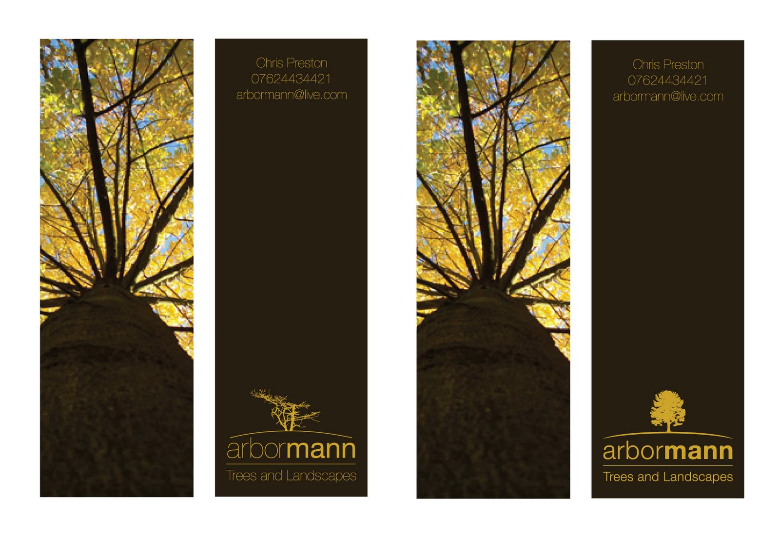
At the minute i like the new direction - i think im going to have one last look at the layout of the logo and contact details. I feel it may work with the logo up top. This also works better for the hierarchy. But at the minute im more than happy with the logo, imagery and colour pallet.
No comments:
Post a Comment