Tuesday 30 March 2010

Final presentation boards


Bacardi - Final Boards

Below are the final 3 design boards which myself and Andy sent off to Bacardi in response to this YCN brief. The finish of the boards was professional and well presented.


Above: Our final board which describes our interpretation of the brief and the audience we targeted in our campaign.


Above: Our 4 final ads put onto our design board which shows our concept and final resolutions.


Above: Our 3rd and final board is to show our final resolution in context. Here i took a photograph of a bus stop and copied it in illustrator. The reason for this is so the viewer does not get distracted by a normal photograph with tarmac an metal etc.

Bacardi - Final Ads

So these are the final four ads which we selected to put on our presentation boards. We felt these ads had presence in their images and a unique and humorous style. The tone of voice is similar - humorous and different to all other alcohol ads currently on the market.
However the ads have come out really well as final resolutions. A unique style, no half naked women, and very dark shadowed colours have all worked together to give a great ad.


Both myself and Andy are very pleased with our final resolutions. After struggling with concepts in the first few weeks we literally produced this concept in 4 or 5 days - thats from design and development to the final resolutions.
Next on our list of 'to does' was produce our 3 final design boards which we would be sending off to Bacardi.

Bacardi - Advertisement Series

Here they are. Th final sequence of ads (excluding 4) Both myself and Andy are very pleased with how these have come out. We feel the layout is great, composition of imagery, type and logos works really well.
The colours given from a long exposure image have worked to our advantage aswel - we borrowed a tripod to help achieve this, and i think it has worked its part.


Well im pleased so far. Next blog post will have our final selected 4 pieces which will also be portfolio pieces. Enjoy.

Bacardi - Advertisement Mockups 2

Me and Andy decided to make some more mockups before investing in bags of ice, mint and borrowing a tripod etc. These were the final four of the mockups which we decided to experiment with the layout, type and logos.


The imagery came out really well. Considering these are just mockups - the layout and colours in the images look really professional. We played around with the 'Men at work' slogan and decided to add 'Mojito' (excuse the spelling mistake - these were just mockups, plus im dyslexic - nightmare)
I feel these are starting to look really good and work well to stand out from other adverts you see which include half naked women and beach's ... i feel me and Andy are onto something here.

Bacardi - Advertisement Mockups

After producing the quick mockups you have seen on the previous post - Both me and Andy decided it would be better to make some more mockups with primary imagery. So we gathered together a few tools, a glass, some ice and a chopping board then set off to work.


The images came out really well. Through paying a lot of attention to layout and composition of the objects we were able to take some really nice shots. We mocked up the Bacardi logo, the 'Met at work' slogan and a small detail about the drink-aware campaign at the bottom. Layout for the logo's and type are yet to be finalised however the imagery is coming on well - its all about attention to detail now.

Friday 19 March 2010

Bacardi - Advertising Campaign

So below are the first set of mockups using stock imagery to show you first hand what direction we are thinking of going in. These are literally 2 minute jobs each - however it does give you the sort of outrageous, male directed tone of voice and style we are going for.


Colour and layout are essential when it comes to photography and producing the final series. Looking into Bacardi's previous advertising campaigns, the colours are dark and the layouts are essential. Me and Andy agreed to props to use, which will consist of: Hammers, screw drivers, spanners etc.
Tonight i will once again be experimenting with the layout of the images. Actually using our own props, lighting etc. Might even throw in a bit of type for experimentation.

2nd Crit - Feedback

Below are the feedback sheets we received after our 2nd crit. The majority of the feedback was good - we were told myself and Andy had addressed a suitable tone of voice and the correct target audience which Bacardi had requested in their brief.


After the crit both me and andy agreed to carry on development with the bottle label, storyboards for the tv ad, and start to produce imagery for a poster campaign.

Bacardi - Label development

So i took one of my label designs into illustrator and started to produce it using tools which i could change the weights and strokes. It was hard to try and get the label to work - thinking it had to wrap around and not overlap itself to spoil the design. Below is the first stage of piecing together my design and laying it out ready for potential printing.


Above i took the developed label and decided to play with colour. I thought using a lime green would be tasteful and run in theme of the Bacardi Mojito's - using mint leaves etc.

Above top left - The original illustrations i took into illustrator to start producing shapes with more weight, stroke and the use of colour. Now to take these to our next crit ... and see whats what.

Bacardi - TV Ad

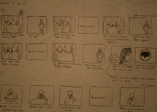
As mentioned in the previous blog - me and Andy decided to run along with our bottle label 'rebrand' .. we would also produce/storyboard a television ad which would be a big part of our new Bacardi advertising campaign.
We had several different ideas for the tv ad. Most of them which would be based around the usual male orientated alcohol adverts. The storyboards which were produced by Andy - they show a fair amount of detail and explain camera angles etc.


We decided to produce two mockup storyboards to take to our next crit. We had a couple of strong ideas which we thought could develop more with input from our fellow designers in the upcoming crits. Still need to hammer out more designs though.

Bacardi - New direction

So when me and Andy went back to the drawing board. We came up with several new concepts and directions to go into. However with our new direction we had to think about our target audience and tone of voice. We decided it would be best to produce a new bottle label and an advertising campaign to compliment and run along side it.
Below are the first drafts at producing some new illustrations for the Bacardi bottle. I took influence from Malibu's limited edition bottles. Colour and type is not an issue at this point of the design - just shapes, strokes, weights etc.


I tried a range of different illustrations. I looked at Bacardi's previous bottles designs, poster designs and other bottle ranges. Me and Andy have been discussing what style and imagery we would like to include in this label. Clouds, water, beach's and palm tree's are essential in this design. Next stage ... take a final mockup into illustrator and start producing the label.