Same as below, but playing around with one colour and the opacity of the colour. Thought i would add it anyway. Enjoy ..
.jpg)
Sunday, 6 December 2009
ZoOm
Lets start playing with the word 'zoom.'
One of my three words which i decided too develop while developing my own skills on the new software i earlier mentioned - After Affects.
Below: This is my first real attempt at using the basic tools we have been taught too 'Transform' area of letters or words. I will view the word 'Zoom' and take into account what a photographer associates with the word. Enjoy ..
Saturday, 5 December 2009
Motion Graphics (practice practice)
Okay - so this is the final practice im having before i make a start on my actual chosen word. I tried using several different tools too make different affects. These include the opacity, scale, position etc.
Motion Graphics (more practice)
Okay, having a play with more type and bringing in the one chosen colour (not including the black and white) Anyway ... enjoy!
Friday, 4 December 2009
Motion Graphics (the begining)
Want too see a very first attempt at motion graphics that will amaze and inspire you? well this video is not it. This is my attempt, quick 2 minute job, Which i was pretty proud of haha!
New Brief!
New brief - sounds amazing!
Motion Graphics - and im very excited about it. Were going too be learning how too use new software (after affects) which is awesome!
Breaking the brief down into a short explanation - we have too take 1 of 3 words which we choose from the 'randomizer' and produce it in a 'silent movie' motion graphic. Were limited too black and white, and one other colour (not including gradients)
This is going too be very enjoyable.
Random
Thought i would put this up.
Its one of several final mockup t-shirt designs that i initially designed for the live brief 'Electronic Poet.' However when i went too the final briefing a week before deadline - that i had totally misunderstood the brief.
The brief stated that the designs must have some sort of relation too the word 'tribe' So designs must include eg: a design based around tribal colours.
My design was based around the 'electronic' area of music. I read the word 'poet' and targeted my deigns too be based around lyrics and music.

I tried too be clever while being subtle with the design. as you maybe able too see, i attempted to make an image out of several aspects too do with music. The circle obviously makes the vinyl which i placed the female singer on. Headphones on the woman meets the centre point of the vinyl. While the player also makes a microphone.
Im very pleased with my design, i may even get it printed myself - because i love it!
Tuesday, 24 November 2009
End of Module Evaluation
1. My ability too research during this project i feel was successful. I gathered a bulk of secondary research from both the internet and library. Primary research however was not as successful. although i did gather a fair amount, i did not make use of time too make questionnaires and such like for others opinions, i feel this could affect my overall grade however, with my subject being skydiving a consider a massive amount of my research too be the skydive i took part in (granted months before this project was set - but it still counts)
2. Experimentation for this project was more obvious too previous project i had done. This project i experimented with toilet tissue, different stocks, and even the centre of toilet rolls too produce what i feel was a successful brand and package. I feel i have become a bit of a mac monkey although my development sheets with quick ideas and drawings show that my ideas are initially put down on paper - not straight onto the mac.
3. I feel the breathe of ideas i had was a successful amount, and that i chose too develop my final idea at the rite stage in the project. I do feel i used my time affectively however not too its full potential at all times. The development i did proved very useful as back up work too my presentation boards.
4. I choose too take the same approach i had too later last year, where i document design sheets and research sheets in a clear A3 design folder, but use my blog too document the majority of my findings. Once again i found my blog a lot more useful too document development, however the folder came in useful for group crits and too get advice in the studio from tutors.
5. I feel my work was a good success, however my final presentation boards do not show my development and concept too its full potential. I feel however this has been a great learning curve on how in future i will be handing work in for assessment and grading. My final design boards admittedly are not as aesthetically pleasing as they could be - and my 16 page booklet really does put them too shame for legibility. layout and design. With this taken into account i would be happy too walk away from this module with a 2:2 - i have seen my strong and weak areas through this unusual and new way of handing in work and feel i can do a much better job.
Wednesday, 11 November 2009
What is 'Good' - Part 2
Below is my final leaflet (each side) Directly below will be the front side. Which will always be on show too the viewer and the 'skin' too the roll! Bottom is going to be the back, which will not be legiable until the viewer has 'torn' their way into it.
Im pleased with how this has come along, I will be speaking too my tutor tomorrow for guidance and advice too whether I should do anymore too it or not.

What is 'Good' - Part 2
So finally deciding upon the design and layout, mock-ups was the next step ... enjoy!

Several of the mock-ups that i produced when i started on this new idea! Handy double sided tape holds the together great.

After designing a quick mock-up of the outside of the leaflet, i printed it straight off and started playing with the fold and size. My first mock-up was smaller than i wanted, so size had too change.

Quick snap of how the real product may work. Again this is only a mock-up but gives a great impression of what the product is capable of!
Next steps - redesign the logo and leaflet all together. Keep the existing idea of unfolds and pull tabs. Colour ... maybe a poo colour?
What is 'Good' - Part 2
After designing away at uni, i was in a real creative zone ... so what better too do than go home and play with toilet roll - yeh nothing better! So below are some experiments a did with the toilet roll, seeing if it worked and / or looked good!

I wanted too test out how the 'pull cord' would actually look, and if the scale, layout was correct. From what i found at the start - its good!

Again, same type of experiment looking at how the product would look fully torn ... and i still like it, and going back too it - its an original idea for how too promote a brand through a 'standard' A6 leaflet.

After the 'pull cord' has been fully torn off, it will leave nothin but a piece of A6 paper/card. When i did this, i found the way the stock folded around would be lovely and relate well too the shapes of the parachutes.
Next too do - work on a leaflet and start applying it too this design ... dont forget the pull cord!
What is 'Good' - Part 2
So now i have developed my packaging (which im very pleased with) It was time too begin the advertising campaign. I decided a flyer would be best for this, so after a lot of research and idea generation, it finally came too me on how my flyer could be one of the most original and only 'packaged' flyers out there.

So this is where my concept started taking place. After a load of fast designs I thought about the 'pull cord' used on parachutes ... and then proceeded to find if i could use this in my advertisement / promotional campaign.

So i decided too get back too the simple toilet roll centre (the brown card thing) and base my flyer design around that. This made it easier for me too bring in my idea of using a 'pull cord' in the design.

Above shows how the viewer must actually interact with the product / flyer too gain the information. The plan is the 'cord' must by pulled down (torn off) then the flyer will open up and reveal all the relevant information.
More development needed however it is starting too take form, keep up to date, im on this all night!
Wednesday, 4 November 2009
Random
So me and the boys were chatting about the previous nights events, joking around about alcohol and who took who home etc ... when Rohypnol was mentioned - well that was it, i just had too slap something together quickly for a laugh, so here it is!

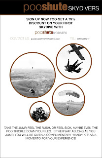
What is 'Good' - Part 2
Well, let the designing begin once again! After drawing and sketching down ideas which consisted of a range of ideas including: drinking products, holders, bags etc i decided my strongest idea was too produce a package which could hold toilet paper and sick bags.
I want my product too be humorous for the viewer and too promote my company using a different technique too usual skydiving companies serious tone too the audience.

Above - my original design which i was initially pleased with. Once looked upon in a different way however, the red could be associated with blood (or death) and the cross at the top does not help as people would link this with hospitals and again ... death.


Above - the original design put onto the packaging (once again self designed) I wanted too build an original package which could be used purely too hold my pieces (toilet paper and sick bags) I produced this design before i thought about the colour relation to death as mentioned in the text above.


After reworking the colours and changing the cross this is how it has come out so far. I replaced the red with a bright and natural colour blue. In turn this worked well with a pink/purple. These colours related too my activity which is extreme in itself plus these colours are more attention seeking which works well for my target audience and tone of voice.
 After a very successful and helpful criticism today (wednesday) it was put across too me even though the company name 'parashiit' is good and humorous, it could also work in a negative way and scare people off. I was told there is a fine line between what i am trying too do, and i was working it well, but needed too change the name too make it a success. so along came 'pooshute' ... hilarious, and not scary in the slightest ... gives anyone a slight grin when read.

So i chose my design, the type i wished too use and the layout - and so far i am very pleased with the result. The packaging style and form is as good as i hoped and now the logo design is coming along a treat.
.jpg)
.jpg)
Final image - only one subtle change here but i feel it makes all the difference and looks more professional! I loved the way the piece was working, the layout, image, type etc, although i felt there was too much white! So i changed the logo type from white too purple - subtle but much nicer!
Subscribe to:
Posts (Atom)