Saturday, 16 October 2010

Arbormann (Clothing)

Okay so it was time to put the logo across different medias (including clothing) Since safety is a big part of this industry i thought it would be good for Arbormann to show their professional finish not only with the business cards but also with what they wear.
I turned the logo into a smart object and imported it into photoshop. Here i tinkered with the layout of the design - I had to get rid of the logo which was already on the helmet (not hard)
I feel the Arbormann logo works well on the helmet. I think I will get these printed on clear stickers so they can be placed straight on the helmets.


Arbormann 11 (Final)

Okay so this is the final logo and business card. I had a bit of a stressful point during the brief where my client informed me of some sort of misunderstanding to the company name. Long story short - I have searched previously to see if the name already exists (which it does not) so I have copyrighted the brand name to make it exclusive for my client. I have looked into legal terms and im covered because I have produced and catalogued all the artwork for the development of the logo.
Im very pleased with the final outcome. I feel i have worked the colour pallet well and that the final prints will be very proffessional and printed at a high standard. The front of the card will be a gloss finish where as the reverse side will be matt with spot varnish over all the type.

Thursday, 14 October 2010

Personal Work (Possible Brief)

Couldn't sleep last night - so i randomly started producing a poster series.
The tone of voice is obviously humorous (dirty humour) while the audience is male from the ages of 16 - 30 i would think.
Im actually very pleased with this series - they make me laugh and its a bit of fun. Might screen-print these next week when i have some spare time. Happy days


Sunday, 10 October 2010

The Loft (Day Brief)

We were given a day-brief today. Well not even a day (around 1 hour) we were asked to produce an advertising campain using flyers to promote 'The Loft' to businesses that wish to hire out the venue for staff parties and promotional events themselves.
Althought The Loft is also a night club at weekends, the main purpose of the venue is to attract corporate companies to hold their functions in The Loft.


I found this brief a bit unusual. I tried to get some good ideas out as quick as i could, however i actually struggled with the type on these pieces.
I have decided i do not wish to persue work with this client. I wish to become more confident with short briefs (possibly create a few of my own) before i get 'real' work like this.

Friday, 8 October 2010

Arbormann 11 (Possible finals)

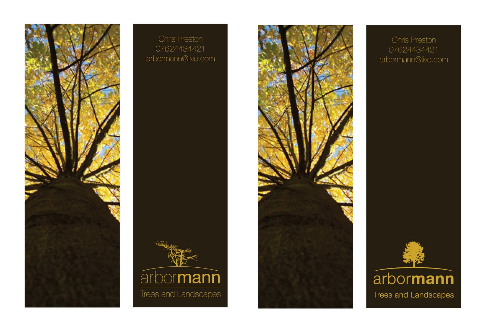
So below I have two of the final resolutions. Here im looking into where to postion the final logo and contact details before i get the cards printed. I feel the lowest example flows better from top to bottom - however in terms of hierarchy the top design is the rite way to go. This tells the viewer what the business type is, what they do and how to contact them.

I feel i will be going ahead with the top piece because of the reasons above.
Printing - I feel a high gloss front with a matt brown reverse side with spot varnished type. This will give it a very professional and high quality finish which im sure my client will be pleased with.


Arbormann 10

Okay - so below is the revised logo. On the left you can see the existing logo with the half dead tree at the minute. On the right is the new logo where I have brought in a new 'lifelike' tree. I have also rounded the bottom line to give it a better flow above the type.

At the minute i like the new direction - i think im going to have one last look at the layout of the logo and contact details. I feel it may work with the logo up top. This also works better for the hierarchy. But at the minute im more than happy with the logo, imagery and colour pallet.

Arbormann 9

Once again turning to the layout of the contact details and the logo - i decided to place them straight and allow space in the centre for the buisness card to be held allowing the viewer to see all the details. However now it comes to the decision of hierarchy - shall i put the logo at the top of the document or the contact details followed by the logo in a bold print finish.
I decided to go with the design on the right - i feel it has a better flow and even with the logo at the bottom it is still a very prescent design on the reverse side.

To do list:

  • print out and test legiability
  • Review current logo (tree mainly)
  • decide on typefaces weight for contact details

Arbormann 8

After going back to the brown reverse side. I changed the type back to a clean golden-yellow. Once doing all this i then went back to the layout for the type. I have been finding it hard to place both the logo and contact details together on this small canvas since reducing it to half the size for more affect lenght ways.
I feel all these layouts are to fiddly to the user to read. Plus i need to look into legiability and print off some mock-ups for testers.

Arbormann 7

I decided to have a quick experiment with colour on the reverse side of the business card. I tried to take the golden-yellow from the frontside image and the turned the type to an aok brown colour.
I did like the finish however when I look at it i think of caramel chocolate. I did like the type in brown however i feel the cards look more professional with a darker finish.
The type still needs to be looked at along with the current logo. I feel a more affective and lifelike tree would be appropriate instead of a half dead branch.

Thursday, 7 October 2010

Arbormann 6

After my previous post I set out on a mission to find new imagery and play around with the layout. I feel I have achieved this and that the business card is starting to take a nice direction. I still need to play around with an illustrated logo - however for now I am certain that the scales, type and colour pallet is working well. Belows examples are the initial experiments with the type layout and colour. The lowest examples show how i have experimented with the scales of the business card. I have never done a portrait business card, however i feel it works well with this subject matter. The image helps carry the unusual format for a 'height' factor.

Next to do list:

  • Illustrated logo
  • Print out mock-ups to test legiability
  • Work on reverse side of business card


Arbormann 5

Okay so now i have decided to take the business cards in a new direction. I have decided that I will be keeping the logo type based (however i am still considering a small illustration to run alongside it) Belows developments are okay for the time being. Im not fully committed to this image that I have used and feel one with a more vibrant colour pallet would do the trick.

Things to consider:

  • Scale and shape
  • Colour pallet
  • Imagery
  • Illustrated logo
  • Reverse side?

Wednesday, 6 October 2010

Arbormann 4

Taking the design in a completely different direction here playing with both type and image. By using a limited colour pallet the design is both cost affective and eye-catching. After doing these designs very quickly i have found that it may be a better option to keep the business card standard scale however play around with the colour pallet and possibly incorperate the use of laser cutting.

Arbormann 3

Im trying to experiment with the scale and shape of my business cards at the minute. After recent success with my own identity and stationary set I feel this would be a good direction to take my work. The designs below reflect this in terms of playing around with the scale and shape of the artwork. I feel this is going in a good direction however i have not exhausted other concepts yet which i plan on doing.


Arbormann 2

I decided to go back to the drawing board and sketch up several new ideas. Below are a few of them once again taken into illustrator. As i said in my statement of intent i plan on experimenting more with the print finish of my work. These designs were produced based on that idea. I would like to see the final business card possibly embossed or foil printed dependant on the final resolution.

Arbormann 1

Work has begun once again. The brief which I am starting with is Arbormann Trees and Landscapes. The brief is to produce an identity for this new tree surgery business. There are no limitations in terms of design, colour pallet or finish. Below are my initial ideas put into illustrator however I am not satisfied with these and intend to develop the identity further.