Sunday 28 February 2010

Final Creative CV

Here it is. After several different 'final' CV's i have finally produced the one which i will be sending out to design houses for a potential summer placement. Throughout the whole design process i have always had an idea of what i want my piece to look like. Each 15x15cm square will make a 'piece' of design itself. Once this piece has opened up, it will make a 30x30cm poster which will give the viewer details such as my name and profession.

* Please note the vertical and horizontal solid black lines will not actually printed - these are guides to you on where the piece will fold.


Above: This will be the reverse side of my CV which will actually hold my design details which include - Software, design, education etc.
I decided to make this reverse side as simple as possible. Using only black and the opacity tool i managed to keep this reverse side simple. I thought it would be a good idea to show more of my layout skills mixed with typography and a small hint of image using small pictograms in the bottom left.

All in all? Very pleased with the outcome - heading into uni early tomorrow to get it printed and photograph it. So exciting ...

Thursday 25 February 2010

Module 3 - Rationale and Brief

As a part of becoming a collaborative partner we had several issues to address before we started designing. Firstly we had to write out a rationale - which we answer issues such as:
  • What the problem is
  • What we intend to do
  • Target audience
  • Message
  • Print methods
This was an easy enough task. We addressed issues which came up reading the brief - such as the history and reputation Bacardi has with its customers.


Our second task - was to go back to the original brief given to us by Bacardi. We had to read through it, and clarify and edit any issues we had with it. Because the Bacardi brief was so open - Myself and my partner Andy decided to set our own restrictions in the brief so we could focus on a certain area instead of getting sidetracked.

Tuesday 23 February 2010

Module 3 - 1st quick brief

So we arrived on a bright and early morning to arrive to our first briefing. We already had an idea of which briefs we were allowed to choose from a long list on the YCN website.
Over the reading week we started to choose our ideal partner to tackle this elaborative brief. We were too look at such design areas as: do they illustrate, good with type and layout etc.
So we came to the briefing and were requested to produce two A3 posters - one to advertise ourselves as a designer. The other to publishes your ideal partner and the area of skills you are looking for. So we were given 2 hour to produce them - bit of a relief compared to our previous 5 week brief.


So there they are. If i could change one thing - it would be the opacity of the 'IS THIS YOU' title. Pretty pleased with how they came out. Not bad for 2 hours work.

Sunday 14 February 2010

Module 2 - Evaluation

Throughout this module i feel my research has been appropriate to my idents. Starting by looking at a large selection of idents from BBC to Film4 has helped very much however looking in detail at the Film4 idents has helped me make decisions on style, audience, tone of voice etc.

Showing experimentation and development throughout this module has been a strong point for me. I have kept blogs up to date daily by showing examples of imagery, type and sequences i have produced and keeping constant evaluations of what i would change and keep. Because of this, i didn't feel it necessary to put them on my final dvd. If i were to go back and re-produce this project - i would take more time with my imagery style and layout. I feel as though my idents work both individually and as a sequence - but more detail could have been made if i took my time with the images.

This project has been hugely enjoyable and has taught me a lot both in design and time management skills. My time development was never bad - but through this project keeping focused and having a daily 'to do list' has kept me on the straight and narrow. Learning new software has been a large part of this module - and i feel my understanding of the software shows through my idents.

Coming to the final piece - producing packaging has always been an issue i dread. However through taking my time and having a new 'calm' approach has helped and i actually really enjoyed producing the imagery, type and making the packaging itself.

Did my final product meet the brief - i feel as though it did. In fact i feel this may have been my strongest module since the start of my degree. Learning new software, keeping up to date with my blog and oganisation of files and storyboards etc i feel has been a fundamental part of this module - if i wasn't organised going in and during this brief - i wouldn't have stood a chance.

Things i would do differently:

1. Back-up all my work, all the time. (on a few occasions a lost some sequences and images)
2. Possibly use different media - draw, paint etc.
3. Take my time with imagery ... type is a strong point of mine, i need to focus and pay attention to detail on other areas.
4. Timetable my weeks - no more daily to do lists.
5. Definitely do more hands on work - packaging etc.

Saturday 13 February 2010

Module 2 - Rationale

As a big fan of Guy Rtichies british films - i decided to do a Film Season: Guy Ritchie.
I narrowed down his 9 feature films he has made to just four which i felt have the same style, target audience and tone of voice.

Going into producing the idents - i had narrowed down certain details of what i was/wasn't going to use. Imagery was a big factor. I decided i to limit myself too 2 or 3 images per ident which would all be produced in the same style using filters and layers in photoshop. All images would be finished using a grayscale and a coloured background to suit the tone of voice of the film.

Colour was another important factor. In Guy Ritchie films - its very rare too see green and blue - rarelydo you see tree's or sunny skies. Therefor it would be innapropriate to colour my type green and my images blue. I decided to use my research to select and narrow down my colour pallet. I used dvd covers and poster imagery to select my colour for the type and background colours. For example: Snatch - yellow dvd cover with black bold type. Easy.

The tone of voice and my target audience are a perfect match! Because of the british, adult humour of these films - i targetted my idents to mainly male viewers between the ages of 18 - 35. In my idents i decided to use direct dialogue from each film (with any foul language edited out) which represents the humour for each film. I would also have a backign track or a finishing soundtrack which would be from the films album.

The idents will be hugely type based with imagery support - for those who can't read ... or can't be bothered.

Wednesday 10 February 2010

Packaging - Final

Okay. So after getting my packaging printed twice (just incase) it came to the hand crafting part. So i washed my hands, dried them cleaner than a nuns nickers, and began.
It was important for me to get this rite - i wanted to show myself i could actually produce a piece of packaging which looked good and could actually be used.
After messing up on my first attempt by cutting out the wrong areas - i had one last chance. I took a different approach, i took my time and took moments to look at what and where i was. Finally - it was done, and it looks stunning. Without blowing my own bubble it really did come out better than i had wished! Now all i had too do was get my DVD printed on to match the packaging.


Arriving into what is known as 'the bubble' in uni - i was faced with the technicians telling me that the dvd image printer wasn't printing properly - and the best i could do was print black and white. So me being me, i took a chance, printed a mockup disc to see how good/bad it would come out. Once printed it looked okay - granted it had some scratchy lines where the colour fades, however due to my imagery it added to the haggard affect i wanted ... brilliant!

Tuesday 9 February 2010

Packaging - Dvd cover design

Okay, so here is my design for my final dvd cover packaging. I tried to bring in all areas from my idents and dvd design. Typography, imagery, layout etc. I have designed this is a clever way - and if it turns out as well as i have hoped ... this hand-made approach might pay off.
Below (excuse the border) but the next immediate highlighted area is going to be the immediate cut out point. Further in i have set myself little reminders of which areas need to be removed from the layout.
Next blog will show this being printed and being made ... might make 2 - just incase.

Packaging - Development changes

Okay, so designing in illustrator and photoshop is easy enough. But i wanted too see i had the colours rite and the layout worked.
So i printed off the below left mockup to write on areas which need improvement and changes. I decided the scale of the subject needed enlarging along with the bar code. I felt my name as the designer needed to be a bit smaller so it does not distract or confuse the viewer from what they are looking at.
Below right is the digital print off i got produced in the digital dungeon. The colours are now brighter and the layout of type has changed. Next blog post will shows the development of producing this bad boy.

Packaging - 1st Mockup

Okay, so using some 0.7mm white card, i drew the outlines and cutting points to produce my first mockup. This time, i actually enjoyed what i was doing. I took a new approach to research how to make what i was replicating, instead of guessing. All in all, it came out well - the mockup has allowed me to know my exact measurements and test it to scale.

Packaging - Development

Okay. Was going through a book about web's and how to make them on some ideas on what to produce for my packaging. The idea of using a standard dvd case did run through my mind, as did the simple cd case you buy your dvd in - make a pretty fit cover which looked amazing. But i decided to step well out my comfort zone and ... hand craft! Looking at the web book made the process seems a lot simpler, so below left is a picture of the web in the book i decided too produce. And the below right, is my -- hand drawn -- outline to produce my first mock-up has started.

Monday 8 February 2010

DVD - Studio ... Development

Just a quick insight look into how DVD-Studio works. Below are a couple of print screens of which shows whats going on, which includes the layout and organisation of the dvd menus (left hand side top box) you can see a working schematic.

DVD - Feature Menu Development

Okay, so i decided to carry on producing the imagery for my dvd menu's. I went and created this menu for the option of viewing the idents seperatley. I used the same techniques which include the border, the box and the back button. Done and done ... for now.

DVD - Feature Menu .. Extra's Menu 2

Okay, so went back to the drawing board after my last post and edited it a little bit more. I decided i needed to re-produce my original schematic to a more understandable manner. I will be making 3 choices on the main page:
1. Play
2. Extra's
3. Features

This edit i changed one of the options from 'Imagery' - 'Idents'. I also added a 'Back' button in the top left side - essential button for the dvd, glad i remembered now before it was too late.

Sunday 7 February 2010

DVD - Feature Menu .. Extra's Menu

For the off menu 'Extras' i went for the same style. In both imagery overlayed an coloured etc. I also added 3 seperate areas for different areas (eg- storyboards, imagery and experiments)
Looking at it now, i forgot a 'Back' button ... back to the drawing board.

DVD - Feature Menu Development

And here it is. The final opening image for my dvd. I played with the colour from the last post in the bar. Making it a red colour which is in the image with a thin discreet faint blue border running around it. I have then altered the types colour to be the same as the light blue which is in the image. Looks beautiful, will play better!

DVD - Feature Menu Development

A bit more development here. Added the type to the bottom bar. Think it needs some detailing and playing around with colours - and im ready.

DVD - Feature Menu Development

So i needed an area to put the dvd options. Here i created a long thin box which is initially a spot colour of blue from the background. I then turned the opacity down to bring through some of the image behind. Looks good, now too add type.

DVD - Feature Menu

Okay, so development began with using a very powerful image from Revolver. I wanted to bring in some of the factors from the process of making my idents. I decided to put this image into photoshop and bring in layers which were made from my storyboards for the idents. I played with the colours of the storyboards then put them on a layer behind the Revolver image. Well, i think it looks amazing and with a subtle bar and some Helvetica Neue - it could be the main dvd feature image.

Saturday 6 February 2010

Idents - Final 5

Below are my final five idents. I decided to put them all into one post so it was easier to view them. If you want my evaluation of each video you can view older post which also include my storyboards and screen grabs. Enjoy ...

Lock, stock and two smoking barrels:


Snatch:


Revolver:


Rock 'n' Rolla


Ident5 - Film Season:

Ident 5 - Final Ident + Storyboards

So this is it. After the last experiment i did - i decided using this image and soundtrack was the way too go. I timed the first part of the sequence with the pace of the soundtrack and let the ending run free. I feel the end is the strongest point, and i had jumping type with zooming in (which i have done in previous idents)
The colours work well, and the type even better. The final few seconds show the professional standard which i feel i have achieved - finishing this ident has now made the idents work as a set.

Ident 5 - Imagery and soundtrack (new)

Looking at keeping the same style of my pevious idents, i went back to the drawing board and felt it wasn't too neccasary to have images from previous idents. I obviously decided to keep with the style - and type. But i produced an image of Guy Ritchie in the same style to keep the idents working as a series.
I prefer this style over my previous experiments - and could see this gettin further development for the final ident.

Ident 5 - Imagery experiment

I decided to experiment with the imagery along with the soundtrack in the sequence. As seen on a previous blog i have already prepared my images which have already appeared in the 4 other idents. I can already tell you this is not how the final ident will look. It is to jumpy and does not look professional enough - you could say too simple.

Ident 5 - Potential imagery 2

Another look into the imagery i could use. This time i took the image layers from the other idents and placed them around the Film4 logo. I like this style. But the other is more legible at this scale. Maybe i could use both?

Friday 5 February 2010

Ident 5 - Potential imagery

These are the potential images i may use in 'Ident5'. Looking back at the sequence so far - i don't think i will be using these images in this style. I want the ident to relate more to the others and feel it looses some identity here. I still need to add the ad's for the 'Guy Ritchie Movie Season'. The film4 logo colours are working well and will not b altered.

Ident 5 - Audio, Image Experiment

This is only an experiment - i wanted to make the images flash onto screen in time with the music ... it has a pace which is fun and lively. I like the idea - but im not sure if it will stick.
Also i am currently questioning myself about the imagery. Not the actual image, just the style .. should it remain a screen shot from the film as it is - or should i produce it in the same style as the images used in the previous idents? This could keep the idents working as a series and individually as singles with a certain recognisable style.

Ident 5 - Imagery and soundtrack

I decided previously that some sort of backing track was needed ... the sequence did not run as smooth as i had hoped. Also - imagery ... do i use imagery that i have edited like in the idents to relate - or the images which show on the final few second of each sequence?

Ident 5 - Imagery intro

Adding the first image. Just thought i would give you an example on how it appears. Looking at it now - not fully decided if this is going to be it, however i think some sort of soundtrack could go well with it.

Ident 5 - Film4 Logo intro

Okay so i went back into after affects to play with the intro for 'Ident5'. I wasn't satisfied with what i had previously made, and felt its pace and layout wasn't rite. So after putting together my storyboards last minute last night - i gave it another go, and here it is - possibly going to be used in the final sequence.

Thursday 4 February 2010

Ident 5 - Film4 Logo (Experiment)

Had a play around after drawing up those quick storyboards with introducing the film4 logo. See what you think - need to play with pace and opacity. Also - sorry for the weird frame size ... i messed up. More development too come tomorrow - im shattered now though!

Ident 5 - Storyboards

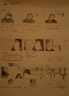
Its 4:09 on a friday morning. And im shattered. Finished my ident for Rock ' n' Rolla and my head was pounding. I needed to pick up something close and draw what was in my head .. hello 'Ident5' (sorry for the 5 minute sketch)


Yeh. Had to finish it at some point. And when i finally did in McDonals. i sketched is as fast as possible in my sketch book (excuse the shopping list)

Rock 'n' Rolla - Final Ident + Storyboards

So. Found the form of type i wanted. And added some background music (the rock 'n' rolla soundtrack) too add more to the tone of voice of the movie. I think this has worked well. Im sorry for not including any centre changes. Got pretty induced in it. Enjoy ..

Rock 'n' Rolla - Development (Dialogue4)

Cut out a section from the back of the clip. Wasn't working with the tone of voice the movie actually has. Working better and runs smoother now. Possibly a little bit more adjustment ... then i think i can start adding sections.

Rock 'n' Rolla - Development (Dialogue3)

Okay. So decided i needed to cut down the first part of the vocals because i didn't think it was to nessasary. Too show you what i mean - i have also cut down the the idents clip to show you what i have taken out ... incase you couldn't hear. This could be a permanent move taking out that last section ... see what you think. Enjoy ..

Rock 'n' Rolla - Development (Dialogue2)

Okay - this is the second attempt at playing with the diaogue. In this sequence i dont take any of the dialogue out of the clip, however i try adjusting the timings and layout of the vocals. See what you think. I didn't like it - so i went to work again.

Rock 'n' Rolla - Development (Dialogue)

Okay, so here we are again - the start of my Rock 'n' Rolla ident. I decided to take a different approach to this ident, and after producing my storyboards (look to older posts) i knew what dialogue i was going to be using. I added the first image and some type to the test clip - just so you at home have something to actually look at ... for a few seconds.


So here is the first attempt. These are the two bits of dialogue i decided to cut down my ident too which has to represent Rock 'n' Rolla. I dont really like this first draft - its like im trying to pack too much into such a short amount of time.

Rock 'n' Rolla - Development (Dialogue)

Well, im not going to lie. Im not an expert on this film - hence why i have left it to last to produce and ident for ... because in all seriousness i have no clue what im going to do.
After watching the film a good 3 or 4 times during one day and making notes and time references i finally came up with one or two quotes from the movie that i could use.
Below is the imagery which i am going to be using in this sequence.


Colour - As you my have seen ... Rock 'n' Rolla has some amazing graphics already. It also uses destinct colours on its dvd cover and for it advertising posters. I will be using a lot like orangy/yellow which will also be similar to the colour i used for my Snatch ident.
Style - I decided i would keep my own style, as i have for my other 3 idents. The imagery will be produced in photoshop using layers and converted to a grey scale.

Wednesday 3 February 2010

Revolver - Final Ident + Storyboards

Here we are again. Another ident completed .. just 2 more to go. Production of this ident has been tuff. The film is so clever and dark, it was hard to find a quote (dialogue) i wanted to use in the ident. After making a start with one quote and getting about half way through - i quickly realised i had made a mistake and that i needed to re-think what i was doing. So it was back to the drawing board and i watched the film several times again until i found the quote, or in this case quotes, i wanted to use. I decided to scrap the imagery i was currently using, and produce new layers which would go well with my type. Im pleased with how this ident has come out, it managed to keep the style of the others while having its own identity. Looking back, i know i made the rite decision to scrap the old ident - and im glad i did so so early on instead of getting into polishing a turd.

Final Crit - 5 Questions

5 questions that i needed to prepare for todays crit, and here they are ... enjoy the crit!

1. Do the videos and imagery used in my idents compliment the movies?
2. Do the idents produced so far work on their own and as a sequence?
3. Am i showing technical competence considering that after affects is new too me (and the rest of us)?
4. Is my blog up to date and easy to follow?
5. Audio - Does using the dialogue work - or should i just use music?

Tuesday 2 February 2010

Revolver- Possible Final

So this is one of my possible finals. Only a draft for now as there are 1 or 2 areas which need editing and finishing off properly. But at the minute i love this ident - due to knowing the story lines of the film, the plot and dark nature etc ... i feel it represents the film well, and that it is a strong candidate at the minute for the final clip.

Revolver - Halfway

After repairing my little mistake of not adding the second part of the quote on new layers - here is the ident as it is taking shape at the minute. Its coming along well so far - and i have a good half the video to add my second quote ... good times!

Revolver - Mistake

As you saw on the clip below, i have started on my second attempt at my 'Revolver' ident. However while in after affects i quickly realised that i had not produced the layers for the second part of the quote i am using. I have also decided to add an extra quote onto the end of the ident - which will add enfaces to the dark nature in this film.

Revolver - New begining

After making the brave decision to scrap my other video (even after a sleepless night producing it) i didn't feel it represented the film well enough. The film is dark and very powerful - its like art meets paranoia and intellect! So i felt a different quote and use of dialogue in my ident would compliment and represent this film, in its individual form perfectly. Im not fussed about the quote not matching other i have used in different idents because the style of motion, imagery and typography is what keeps a connection to the Guy Ritchie film season.

Anyway below is the new start. As you can already see, new imagery. In this piece i tried to give the affect on two halves of a person - lighter and darker. I kept the background an image instead of a flat colour because of the story it could potentially give the viewer. The dialogue/audio has new been completed and cropped, all that is important at this stage is the opening 4 seconds. Enjoy

Monday 1 February 2010

Revolver - New image and type

Okay, so here it is. After scrapping the last ident i was in the middle of producing, i went back to the drawing board - gathered more images which fit with my dialogue from the film. Like my last two idents for Snatch and Lock, stock - this motion will use a strict colour pallet of just black, white and a dark red. As seen on my 'Design context' blog i researched into Revolvers dvd covers and premier posters for colours which they used.

Revolver - Decision time.

The ident i have been working on seems to be going well. However after watching through the movie once again and watchin trailers as part of my research i have decided to scrap this sequence. The quote i was using; ("The art is for me to feed pieces too you, and make you believe you took those pieces. Because your smarter, im dumber.") is definatley a clever line in the film, however i have made the decision to scrap this ident now, as i have found a new quote, which i feel represents the film better.

"In every game or con there is always an opponent, and there is always a victim."
"Where's the best place an opponent should hide"
"The very last place you would ever look"

Keep in tune for what happens.

Revolver - Audio development

It came to the point where i was producing my images and layers for type, and i was still faffing around with the audio and dialogue for this ident. So i decided i would put all my audio into after affects and get it sorted now. This means putting the dialogue at the rite pace, cutting out swears, cropping out background music and noise.
Because i have done this now - i have saved myself from wasting a load of time constantly adjusting the audio to match each bit of my imagery.