.jpg)
After taking a look into different typefaces and selecting several, which i would develop further to adapt the font to make a logo for Domino Records - i decided to begin with 'Dryflash' and 'Gill Sans' which were two of the sans-serif fonts i thought i could work with.
- Dryflash - which are the first 3 designs on the left hand side went okay. I decided to start playing with the positive and negative space of the letterforms. I like this font however i feel it has little personality or relation to my project.
- Gill Sans - this was to be a very short experiment with this font. While sketching i looked into the Domino's Pizza logo and realised this font is much like the one used in their ad's. I did incorporate and image of a domino instead of the 'I' letterform - this could develop further within a different font.

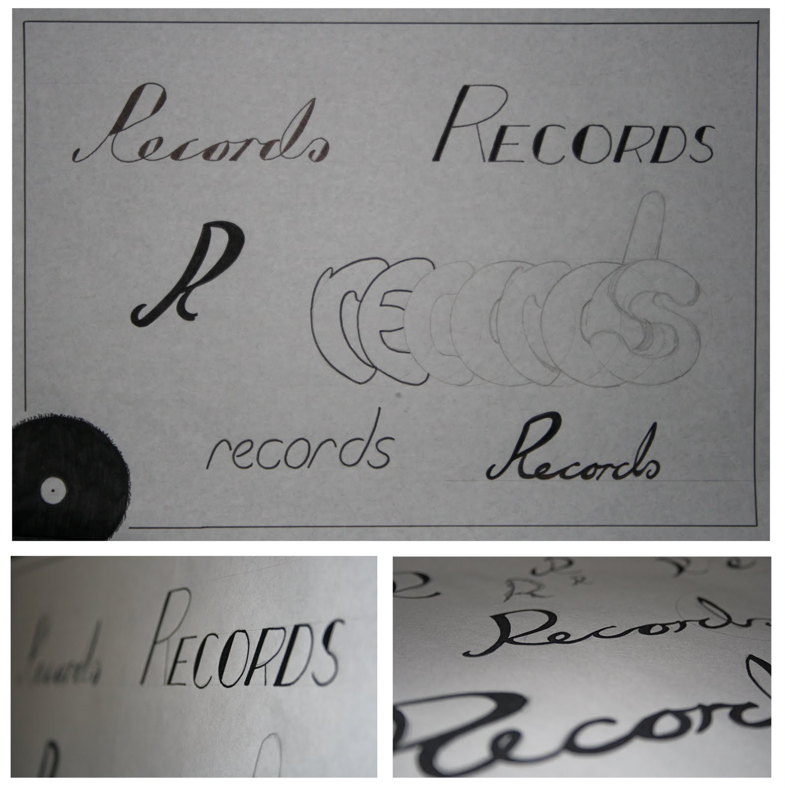
Below: I decided to have a quick play with type for the second part of the logo title. While experimenting with freehand letterforms. I decided that 'Records' would be an uppercase, sans-serif which would sit below the final Domino design (i hope)
No comments:
Post a Comment