Sunday 24 October 2010

PHAT (Music Label)

So PH@! is an already excisting music label based on the Isle of Man. With new deals and gigs coming their way a re-brand is due before they take off commercially. The current logo is okay. However my client does not like the typeface or the colour pallet used.
I have started by making a few sketches in my book - however now i feel it is time to research into current music labels and their identitys.
I feel the typeface is going to be hand rendered - this will then be taken into illustrator and vectored. Unless i find a typeface which i really like and suits the genre of music PH@! caters for.


Saturday 23 October 2010

Arbormann (Compliment Slips) Finals

So here they are. The final compliment slips to run alongside the business cards and letterheads. Im very pleased with how this brief has turned out so far - the next stage is to contact a printers to have the stationary set printed with a high level finish.
I also need to choose a stock which suits the design and reflects on the high standard of design.

Arbormann (Compliment Slips)

Here are the compliment slips. These were easy enough to produce because of the layout i have already set for the letterheads. The only problem i have come acros at the minute is what colour the text is going to be 'with compliments'.
I want to keep the colour pallet as minimal as possible. So i decided to use the brown and gold for the text. The brown has worked a lot better as it is more legiable than the gold. Like on the letterheads - these will also have a front and reverse side which will hold the logo.


Arbormann (Letterheads) 2

Going back to the letterhead design after playing around with the colour pallet in the previous post - i decided to match the colour pallet identicly with the business cards.
I feel this has worked for the better. The layout i took from my previous post of experimentation in terms of where to place the logo and contact details.
When i tried the layout without a background image, it looked too plain without carrying any of the character that the business card holds. So i brought in a new image and adjusted the opacity so that the body text could still had readability.


Above shows my experimentation with the front side of the letterheads. At first i placed the logo in the centre of the page. However once i printed one off and folded it down to fit into an envelope i found the logo was cut off and that it no longer held its proffesional image. So i have now placed the logo at the top of the page.

Arbormann (Letterheads)

It was time to finish this brief. After my recent crit - I was told that I had all the work there and the ability to finish the brief within the next few days.
So i got straight to work today to finish the stationary set for the Arbormann brief. I wanted to make the stationary set work as a series, with colour pallet, type, logo etc. Below i experimented very briefly using minimal colours and transparency in illustrator. I didn't like the finish at all - i felt it was too soft apposed to the colour pallet of the business card.
Back to the drawing board it is.


Arbormann (Final Business Card)

After a recent crit where i printed out what i thought were the final mock-up business cards, it became clear that some of the text was not legiable in an ultralight typeface. I went back to the design immedietley and made sure that all type was legiable.
After printing off the final mock-up i found the colour pallet worked well. The type was complimented in gold sat on the dark brown which was a spot colour from the image on the front side of the golden tree.

The cards will have a high end print finish. The front side of the card will be a gloss finish while the reverse side will be a matt finish with the type spot varnished the golden/yellow.

Thursday 21 October 2010

I Am President (Logo on imagery)

So i decided to go back to the more 'gothic' logo - since the latest one i developed was becoming to commercial and like a stores logo apposed to a bands indentity.
I took the logo into illustrator once again and thought it would be best to see how the logo works across a range of media and mixing up the colour pallet. This logo seems very versatile - and works across all the promotional photographs.
I feel that black background works better for it - and this way it associates more with the current logo in terms of its full title and colour pallet.

Next job:

  • Create a logo using the bands initials
  • Experiment with more typefaces
  • Contact client with a spread sheet of designs. From which they will choose the designs they wish to get developed


Wednesday 20 October 2010

I Am President (Logo Development) 2

Here are the further developments i have produced while re-branding 'I Am President'. I feel these designs have taken a turn for a more typographic finish.
After speaking to my tutor - we decided that the logo designs below were no longer representing the band for their personality and genre of music. The designs I have started to produce - although very elegent and very clever with the type, they do not represent my clients band.

What i will be taking from this series of designs are the developments of typography i made. I will also be taking the circular frame to hold the final logo (for the time being)
Back to the drawing board now:

  • Font?
  • Colour pallet
  • Layout and compatability across the range of media


I Am President (Logo Development)

It was time to start the logo design for I Am President. I posted the existing logo a few days ago and have since reviewed it to find themes i could work with - colour pallet, font, scale etc.
I decided to start fresh at the start and have some experimentation with type and colour. I used one serif typeface at the start and played around with the lining and composition of the text.
For now i'm not to fussed about the colour pallet - i just want to get a feel for the different layouts i can produce with the type.

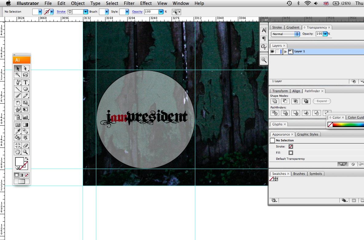
Belows example is using a rather gothic font. I like it aesthetically however im not sure the type reflects on the personality of the band.
The design at the bottom of this page has a very similar layout to the current logo - which is keeping to the clients wishes. One of the members of the band designed the original logo, and seemed a bit off about changing it. However i did make my feelings known saying that it was aged and very basic.
Although im a fan of minimal design - I feel that the design needs to be intelligant while being 'basic'. Colour pallet, typeface and layout are all essential componants to a good design.


Aboves designs are the starting point of my design process. I essentially wanted to play with the layout of the type. See if i could create a logo which could be used across a range of different medias with comfort.
However at the minute im thinking of producing a full piece design which will use the bands full title and further - produce a shortened logo which will use the bands initials. I.A.P

Tuesday 19 October 2010

I Am President (Logo) Initial Ideas

So first things first - get some initial ideas down on paper for the new I.A.P logo. Below are some of the design sheets i produced on my first day fully on this brief. I feel this was a useful excercise and helped free my mind of some good and bad concepts.
The purpose of this excercise was to create some concepts which may not have been possible to achieve soley using illustrator.
I wanted to experiment with typography a fair bit - so i used some of my skills to hand render some new typefaces and further experimented with the placement/layout of letterforms.


I feel this was a valuable excercise. And i have no doubt that i will be using the old pencil and paper for more development to achieve a final resolution.

Monday 18 October 2010

I Am President (Finals)

These are the final series of images i sent to my client. I sent them all the shots taken on the day (146) then sent my colourenhanced finals as my recomendation.
The feedback so far is all possitive. They have forwarded this series to their web-page builder - who I have contacted today and am now awaiting a reply from.
So below are my final series of 13 images, which i sent my client. Im very pleased them all - i feel the colours really are vibrant and eye-catching. I feel these shots really do capture the personality and image 'I Am President' represent.


As i said earlier im really pleased with the final series. I worked with the compositions and layouts of the images - before importing them into photoshop to minipulate the colours in the photographs.
The client liked the final result as do I. Next job on the list is to re-design the existing logo to a more upto date version.

I Am President (Photoshoot)

Photoshoot - So here is a selection of some of the shots i took during the shoot. In total i took 132 photographs however the majoirty of the shots were experimentation for when i changed lenses or when the light was limited. I am pleased with how the shoot went however there is still more work to be done:

  • Edit a selection of imgaes
  • Re-create a logo
  • Album artwork and packaging