.jpg)
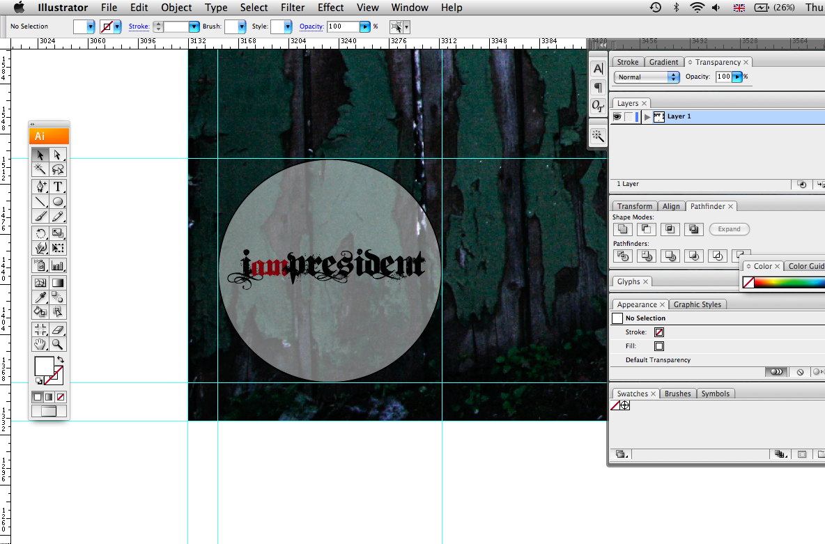
I took the logo into illustrator once again and thought it would be best to see how the logo works across a range of media and mixing up the colour pallet. This logo seems very versatile - and works across all the promotional photographs.
I feel that black background works better for it - and this way it associates more with the current logo in terms of its full title and colour pallet.
Next job:
- Create a logo using the bands initials
- Experiment with more typefaces
- Contact client with a spread sheet of designs. From which they will choose the designs they wish to get developed


No comments:
Post a Comment